When your stationery is always close at hand, it’s no longer just a tool—it becomes a part of who you are!
KOKUYO ME is more than just functional stationery. Think thoughtfully crafted pieces that are as fun to choose as they are to use - colors you wouldn't usually choose, materials you wouldn't normally select, become stylish accessories that reflect your unique style. This series lets you experiment with combinations like you would with a new outfit.
Effortless and playful, these items add a pop of color or a unique texture to brighten your day and make you feel a little more “you.” While traditional stationery is all about practicality, KOKUYO ME redefines it as an ""accessory""—a small but stylish addition that adds joy to the personal and the practical.
- 4th Season Color Palette #Fair Play -

The new KOKUYO ME ""Fair Play"" color concept is all about encouraging a positive, get-up-and-go mindset. It’s a playful yet sophisticated palette inspired by the latest trends in fashion and interiors.
Soft, airy pinks and greens bring a gentle, relaxed vibe, while a vivid, energetic blue adds a lively spark. To tie it all together, a deep red, like the surface of an athletic track, gives the colors balance and a sporty edge. It’s a palette that feels fresh, dynamic, and ready for whatever the day brings.
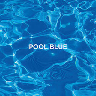
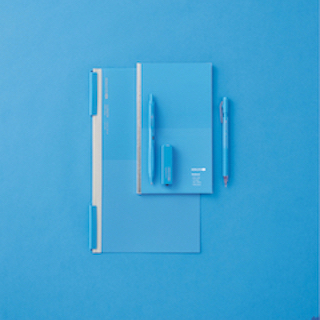
A bright, bold blue that feels as refreshing as sunlight reflecting off a pool of water. This color is full of life and individuality. Whether it’s the star of your look or paired with softer hues, it adds a sense of movement and energy.
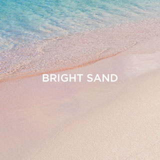
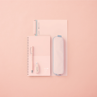
A soft pink that brings to mind the warm, glowing sands of a sunlit beach. With its natural, uplifting brightness, it works as a light and airy anchor in any color combination, with a touch of effortless elegance.


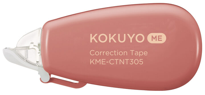
A grounded, muted red inspired by the familiar tones of a running track. This color might feel a little unconventional, but it adds a sophisticated accent to any look, making it perfect for adding depth and balance when paired with other colors.
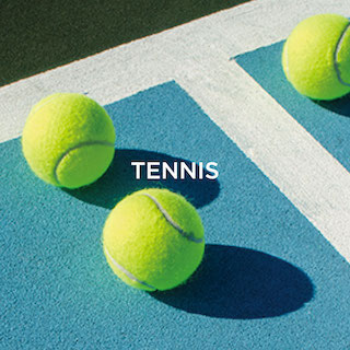
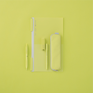
A lively yellow-green inspired by the bright pop of a tennis ball. It’s a cheerful, high-energy shade that instantly adds a fresh and lively touch to the palette.
- KOKUYO ME Design -
- 3rd Season Color Palette #Deep Nature -

The ""Deep Nature"" theme is inspired by the quiet beauty of natural materials and earthy landscapes.
In today’s fast-moving world, with growing awareness of sustainability, this palette captures a longing for balance and the soothing qualities of nature.
The rich, calming colors are designed to ground and empower, creating a harmonious and sophisticated way to reconnect with the world around you.

Canyon Clay
A warm, terracotta shade inspired by canyon walls and ancient rock layers.
While distinctive, its understated, natural tone makes it a warm accent color that pairs effortlessly with clothing or interior designs.

Graphite Blue
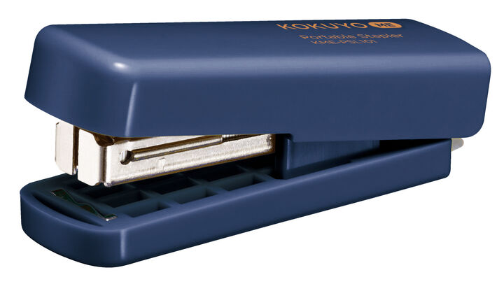
A serene, mineral-inspired blue with a quiet elegance.This color blends seamlessly into any setting, bringing a sense of calm and subtle sophistication.

Dusty Olive
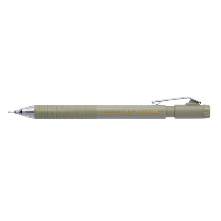
A muted olive with soft, gray undertones, this shade is all about balance.
It harmonizes perfectly with the other three colors in the palette, playing a grounding role.

Piman
A vibrant green reminiscent of sun-kissed bell peppers at their freshest.
This color is bold, bright, and full of energy—perfect for adding a lively pop of vitality to your day.
Whether you’re drawn to the playful energy of "Fair Play" or the serene sophistication of "Deep Nature," KOKUYO ME lets you express yourself in new and exciting ways.
- Past Series -
1st series
2nd series


